Installing Packages in SQL Server R Services is super easy. This blog post covers some basics on what to do especially when you're just starting out.
How to connect to your Tabular Model database and use it as the underlying model for either Pivot Table, Pivot Chart, or Power View

I'm moderating 2 sessions at 24 Hours of PASS (24 - 25 June 2015). Don't forget to register!
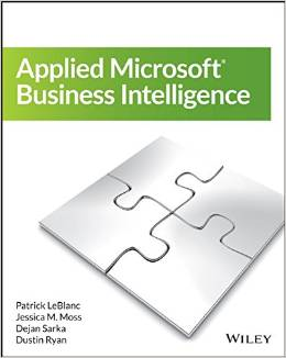
Get ready to open your mind to Business intelligence! "Applied Microsoft Business Intelligence" provides best practices on how to leverage Microsoft SQL Server and Microsoft Office for more opitimised BI.
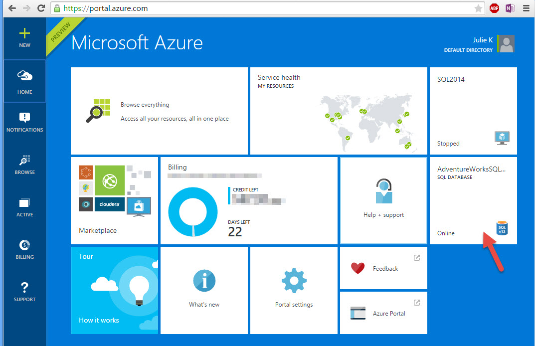
To successfully Direct Connect to Azure SQL Database from PowerBI.com, you'll need to enable "Access to Azure services" on Azure SQL Database via Azure Portal. Here's a quick how to.
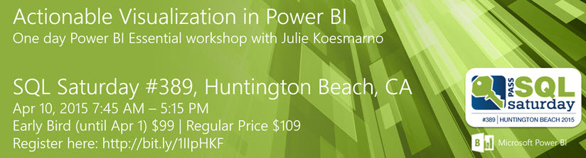
Register now for Actionable Visualization with Power BI Workshop in Huntington Beach on Apr 10, 2015.
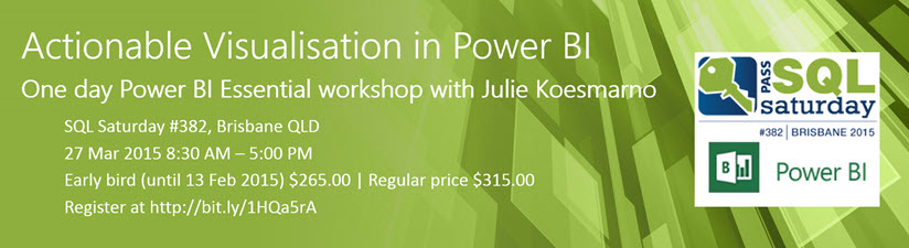
Register now for Actionable Visualisation with Power BI Workshop in Brisbane on 27 March 2015

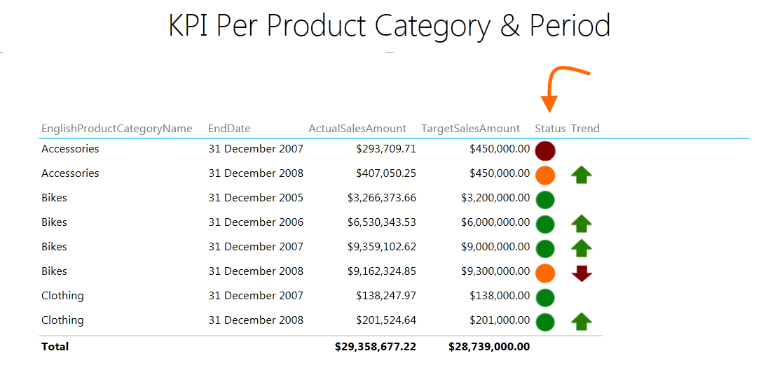
Current Power Pivot / Tabular Model does not support dynamic threshold settings for KPI. However, some customisations on the data model can be applied to enable dynamic KPI threshold in Power View.