In case you missed it, PASS DW/BI Virtual Chapter is hosting a series of Power BI sessions this month. I felt very privileged to be able to attend Jen Stirrup’s (b | t) webinar on Counting is easy, Measuring is hard! Insights using Data Visualisation last week.
To my delight, she mentioned about composition, in particular Fibonacci Spiral. It reminded me of one of the fundamental things that I have learned in photography (as a hobby). So this weekend, I spent a bit of time reviewing some of the data visualisations in Power View that I have created in the past. Instead of just looking at it as just data and information, I put my “amateur” photographer eyes on this. I begin thinking about design, technical and most importantly business components and how to put them together.
Here are a couple of Before-And-Afters, where I have revisited the objectives and composition aspects of these data visualisations in Power View.
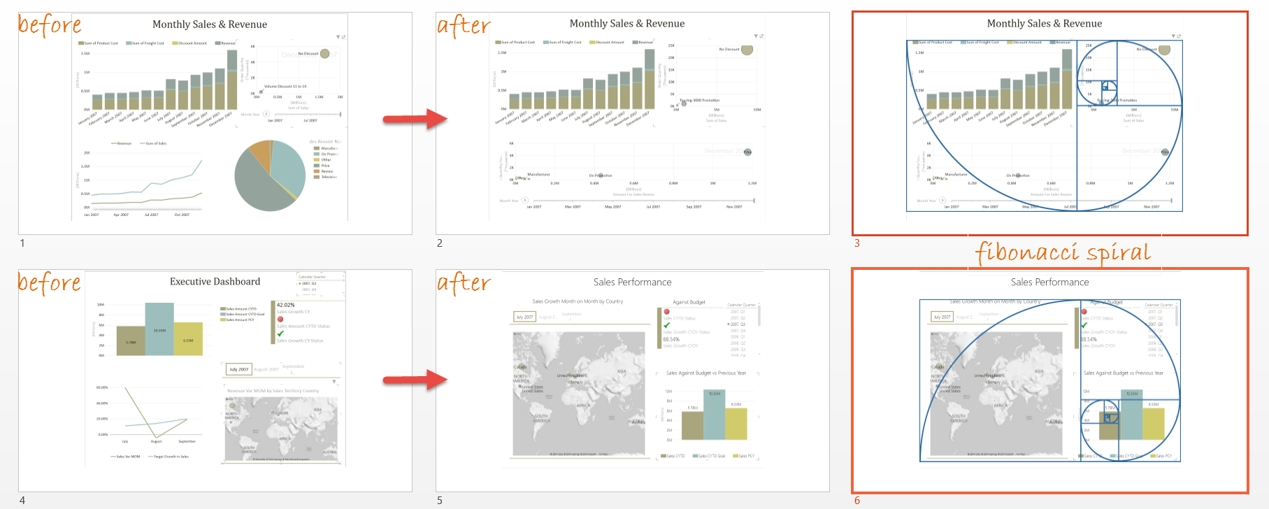
Fibonacci spiral is a pretty cool thing to use / apply in composition. Use it wisely and when it works, it works really well. Not all visualisations have to fit Fibonacci spiral though 🙂
Another takeaway here is that, much like editing photographs, sometimes I have to walk away and come back to data visualisation. With a fresh mind, I ask myself, what are the objectives / questions you want to answer and does the visual aspect support that? And much like photography (or anything really), practice makes better.
If you are interested in learning more about Data Visualisation and Power View, please join me at my “I Want It Now” Data Visualization with Power View 24 Hours of PASS Summit Preview session on 10 Sep 2014 at 5 PM Sydney time.
2 Responses
Hi Miss MsSql Girl,
I hop you are not abandon SSRS. I have a question on how to display month name on an X axis horizontal properties any help
Hi Gabe,
Thank you for visiting!
SSRS is still very useful indeed and widely used in enterprises.
Is your question referring to displaying month name in the X-Axis of Power View in the picture embedded in the blog post?
If so, I simply make sure that I create a calculated column that translates the date dimension to the start of the month, then format it to the “MMM-YYYY” format. I’ll write a short blog post on this soon 🙂
Julie